The PWHL has revealed their jerseys for this upcoming season, and so now it’s time for me, someone who has trained in graphic design since I was a mere child, to comment. I emphasize how long I’ve been trained in graphic design (because my dad was a professional graphic designer) to ensure that you know that I do in fact know what I’m talking about. This isn’t going to be based on vibes or anything. I will be commenting strictly on how well-designed they are from a graphic design perspective. I’m sorry, I’m incapable of going off vibes at this point. I’ve been doing graphic design for too long. Anyway, here we go.
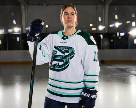




We’ll start with the away jerseys. Not a fan of the striping at all on the Fleet’s jersey. The sleeve piping seems to be consistently spaced, but on the torso, it looks like the spacing gets inconsistent as the stripes get thinner. I get what they were going for, they wanted it to be consistent as it would be if all the stripes were as thick as the bottom one. Unfortunately, it just doesn’t work at all for me. Especially when the sleeve stripes look consistently spaced. I would have been able to tolerate it more if the sleeves had also been inconsistently spaced. Unfortunately, the inconsistency between whether they’re consistently spaced or not just kills. You have to be completely inconsistent or completely consistent. Trying to do both doesn’t work. Pick one. Also, not a fan of the neckline being a lighter green. In my opinion, that neckline needed to be dark green and make it blend in with the shoulders. It stands out in a bad way.
The Frost’s jerseys are just boring. It’s hideously boring. The biggest problem with it is the lack of contrast. It’s a white jersey with mostly light purple. The logo would’ve benefited from having been dark with a light outline, instead of it being light with a dark outline. It blends in too much. The majority of the purple on the jersey needed to have been dark purple, not light purple.
The Victoire jerseys are perfect, honestly. I genuinely have zero complaints. I might have to become a fan due to the jerseys alone. It’s that good-looking. Please never change this design, like, ever. Please. Any other design would be a downgrade. This is an all-time classic. I especially love it being cream-colored. More hockey teams need cream-colored away jerseys. You know, like the Columbus Blue Jackets (which of course would come with their alternates being the main jerseys). Anyway, back on track.
Moving on to the Sirens, it’s good, but it’s just missing something. I don’t know what though. It’s so close to being great, but it’s just missing that “pop”, if you get what I mean. I don’t know what, and honestly, I don’t know what I would change about this jersey. It’s just missing something. I wish I could be more detailed.
I really have no complaints with the Charge jersey, except for the fact that the logo still sucks. That said, I will say, the logo does look less bad on this jersey. Still not good, but this version of the logo is no longer on my list of “25 worst hockey logos of all time”. Yes, I do have such a list. Maybe someday I’ll share it.
The Sceptres jersey is basically the same as the Sirens’ jersey: it’s very good, it’s just missing something. Once again, I don’t know what or what I would do to change it. Very good, just not elite. I don’t have any complaints about it other than it just not having that “pop” to it.
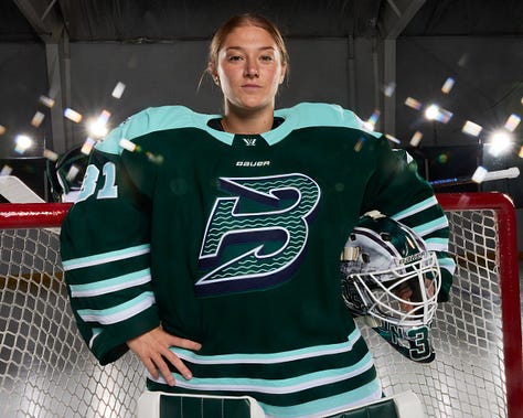
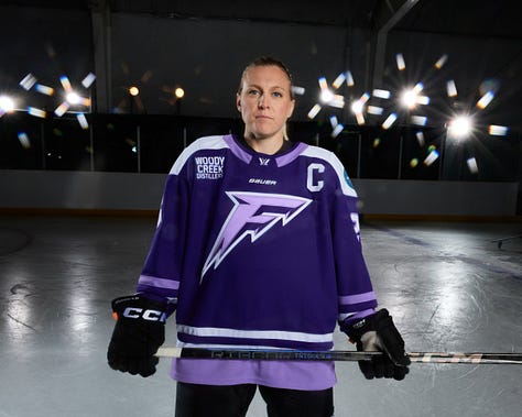

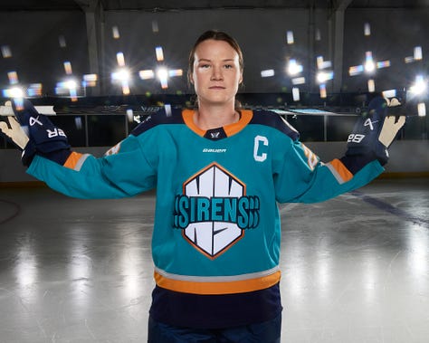


It’s actually astounding how each and every one of these jerseys commits the sin of not having enough contrast. I just want to get this out of the way because it would get too repetitive if I repeated it for each jersey design. There’s not enough contrast for any of them. You know what? Now that I think about it a bit more, maybe the Sirens jersey will get a pass. Yeah, I’ll give them a pass. The others don’t. That said, the Siren’s jersey doesn’t get a pass for the logo text and how easily it blends into the background. Seriously, the repeating “S” on both sides blends in far too easily and something needed to have been done to distinguish the jersey color from the logo text more. Also, the yellow should’ve been slightly lighter, in my opinion. The Frost jersey is very close to having gotten it right but failed by having the sleeve stripes lighter purple instead of white. Frankly, the lighter purple isn’t light enough to create any real contrast. That, and the neckline should’ve been white. The Victoire is also quite close to being perfect but screwed up in having the shoulders dark blue. It needed to have been a lighter color. When it comes to the Sceptres, there needs to be more yellow. Too much blue, especially when both shades of blue are on the darker side.
Now, there are two jerseys here that I personally find to be abominations and need to go back to the drawing board. They are the Fleet and Charge. For the Fleet, once again, the striping consistency is a problem, but also: the color scheme just doesn’t work. At all. It looks fine when the jersey is white, but when you use the dark Fleet green as the jersey color, it falls apart. This color scheme was made with white jerseys in mind. Also, the numbers on the jersey need to have been white with a light green outline, instead of what it currently is, light green with a white outline. Moving over to the Charge: the entire thing needs to be thrown out. I honestly cannot say a single nice thing about it. The logo is awful truly awful and looks even worse on the jersey. Then, the stripe colors are: dark gray, light gray, and dark yellow. So, there’s not only no contrast, but it’s ugly. It looks like a freeway in the middle of a river of blood. Then, there’s the neckline, which should’ve just stuck with the dark gray.
Anyway, that’s just my take on the jerseys. I’d love to hear yours, especially because frankly, I haven’t seen anyone else’s opinions on them, so I’m interested in how they’re being received by the broader public.
If you found value in this article, please consider paying for a subscription here at Prism Hockey, as subscription money goes to other subscriptions such as DeepL (for translating articles in other languages to cover hockey news around the world) or Google One (necessary for storage for my articles and graphics on social media) to ensure I can continue to cover hockey. If you aren’t able to buy a paid subscription, please consider at least getting a free subscription as all articles are free, and sharing this article. I’d also love to hear your thoughts on this article in the comments below (only paid subscribers can comment) or on social media. I can be found on Bluesky, Instagram (Personal | Prism Hockey), Mastodon, Threads, Tumblr, and Twitter.


